Author Archives: EGS

  • -
Independent School Enrolments By Streets and By Schools

COMPETITION AT THE COALFACE

Category:EducationTags : 

Last year I presented some school stats from our national research dataset to a meeting of Victorian Bursars. In one chart, shown below, I ranked Australian Independent enrolments by neighbourhood, according to the average P-12 fees shown by the Household Expenditure Survey, and I ranked the Independent enrolments by school, using the average P-12 fees from My School. Then we took the two sets of numbers and inserted them in the same schematic.

Independent School Enrolments By Streets and By Schools

So what you are looking at here is the average number of students across Australia on the vertical axis and the fees paid by parents and charged by schools on the horizontal axis. The students by suburbs are distributed in a nice blue bell curve pattern, with a mid-point about $10,000 and a longish tail out to the high fee end.

The students distributed by schools, on the other hand, shown in maroon, are clustered towards the low fee end, with a mid-point of about $8,000 and a large bump at the fair right hand side, for the high fee schools. This leaves a dearth of middle fee schools, compared to the average fees paid in the neighbourhoods which provide their students.

This infers schools in the third fee quartile charging between $8,000 and $17,000 should have been growing strongly in recent years, shouldn’t they? But we know from My School data they weren’t.

The My School statistics show half of the increases in Independent enrolments from 2008 to 2017 were in the bottom fee quartile of schools by student numbers, while three quarters of the increase were in the bottom two fee quartiles of schools. This means lower fee schools have been growing much faster than those in the top half of the fee range, but within the top half, there has also been a jump in demand for schools at the very high fee end, charging $25,000 and above. (Bear in mind these national P-12 fee figures tend to be higher in Victoria, and lower in Queensland).

And there has been a softening of demand in recent years for places in middle fee schools charging fees either side of the $10,000 half way mark.

From our national data on fees and our modelling of more than 100 Non-Government schools, we know demand has continued to grow for low fee Independent schools in outer metropolitan areas, among lower SES self-employed working families and supporters of more evangelical religions. The picture changes as we move closer to the higher SES suburbs closest to the CBD.

In recent years, the middle fee schools in middle class suburbs have been adversely impacted by a loss of part time jobs for mothers, who have been unable to return to the workforce in their former sales or clerical jobs, specifically to pay for Independent school fees, as these are jobs being hit hardest by digital disruption. It is these parents who are now crowding out very fast growing high SES State schools in middle white collar suburbs.

The middle class families lucky enough to find part time clerical or sales work in jobs most impacted by technology are living in the third quartile suburbs in our schematic, but more of them are choosing lower fee schools than they would have chosen in a more prosperous economic climate.

The wealth effect among more asset rich families has boosted demand for Independent school places in the higher SES inner suburbs, thanks to sustained low interest rates.

This means economic factors have pulled more of the central bell curve down the fee ranges towards lower fee schools in outer metropolitan areas, while the wealth effect has pulled some professional families in the third quartile up towards the higher fee end. This has left something of a vacuum for the middle fee schools, now competing more with a more aggressive State school sector.

In the future, I don’t think the wealth effect can be sustained much longer, with tighter lending regulation by APRA doing the RBA’s job of higher interest rates in driving down previously fast rising house prices, particularly in Sydney and Melbourne. This infers a softening of demand and a more competitive market in these suburbs for higher fee schools.

If the upswing in the jobs market over the past year or so continues into 2019, we would expect to see more of the third quartile families having the confidence to pay medium to high school fees. If however, the 2018 upswing flattens out during the election campaign in 2019, middle class families across the country will choose the more affordable lower fee Independent school options, or drift off to the State school sector.


  • -
SES Funding Map - Education Geographics

SES FUNDING AND POSSIBLE WINNERS AND LOSERS

Category:EducationTags : 

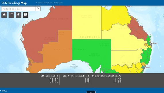
The Commonwealth Government has recently adopted changes in Federal funding for Non-Government schools. These changes remove the spatial weighting for Occupation and Education from the old Howard-era SES scores and instead rely on data linkages to provide a direct measure of matched Personal Income Tax (PIT) for parents and guardians.

A higher PIT means higher SES scores for parents and guardians, lower Government subsidies and higher school fees, after transitioning periods and subject to loadings. With all other factors being equal, the additional fees to be paid by parents rise by about $300 for secondary students for each additional SES point.

Due to the lack of official information released about the impact of these changes on individual school communities, we have had to rely on whatever information was publicly available to assess their broader impact on specific demographic groups.

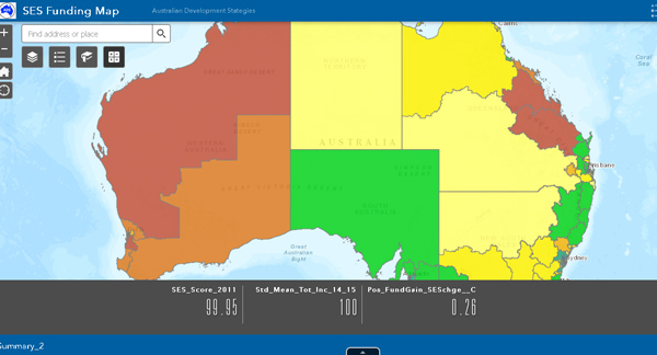
Following the recent by-election in Longman, it has become obvious parents are deeply concerned at any changes to the long-standing Commonwealth Funding formula and that these changes could have a political impact on the election due in May next year. To better inform the public and parents, we have constructed an interactive Map to show some reasonable impressions of how these changes could impact on current Federal seats.

It should be stressed however that these changes by the Commonwealth will be based on the incomes of parents and guardians at each school, rather than on the average residents and voters in our map. There are also caps on the minimum and maximum subsidies from the Commonwealth to minimise extreme variations and there are loadings for specific needs. So the funding for each school is not determined exclusively by a school’s SES score.

From our working knowledge of individual profiles of Non-Government schools, it can be concluded that the incomes of parents and guardians will be higher than those of non-parents as many parents take steps to earn additional income specifically to pay for their children’s education in Independent or in Catholic schools.

The map also shows 2016 Two Party Preferred votes in the same seats for the ALP and Coalition, 2016 primary House of Representative votes for the Greens and 2016 Primary Senate votes for Pauline Hanson’s One Nation.

It appears from the analysis underlying the map data, that the biggest increase in non-Government school fees will be felt in Mining seats, where younger, blue collar parents tend to choose better-paid jobs, often specifically to fund school fees and the mortgage on the family home. This change has been brought about mainly by the fact that blue collar jobs were accorded relatively low SES status under the old SES formula. With this weighting removed, their SES score will rise and the Government subsidy fall, driving up fees.

Conversely, the bigger winners appear to be parents typically living in inner urban areas, with incomes marginally above average, but with extremely high SES weightings for their tertiary education and professional jobs under the old SES formula. This weighting acted, in effect as a de facto measure of job security and superannuation entitlements and when it is removed, their new SES score tends to fall considerably. The extent is difficult to measure however, as these seats also contain high percentages of tertiary students, who we can assume do not have school aged children.

Click on image to view SES Funding Map

SES Funding Map - Education Geographics


  • -
Longman By-Election 2018

LONGMAN BY-ELECTION 2018

Category:By-Elections,National 2019Tags : 

The ADS team has prepared an exhaustive profile of by-election swings in Bennelong, New England, Longman and Mayo.

A full report of the swings and their implications for the 2019 election appears in the Weekend Australian.

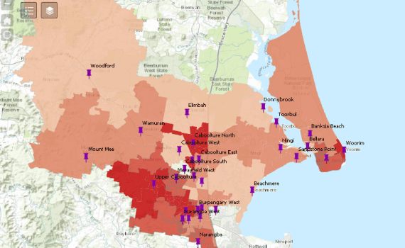
Below is a link to the maps of the swings and the associated demographic drivers for Longman.

Click away and compare the swings to and from the major parties with key demographics in our statistical profile.

Click on the Map to view

Longman By-Election2018, The ADS team has prepared an exhaustive profile of by-election swings in Bennelong, New England, Longman and Mayo.


  • -
Raise the Scarlet High - Glyn Davis - Vice-Chancellor, the University of Melbourne

RAISE THE SCARLET STANDARD HIGH

Category:EducationTags : 

29 August 2018

AFR Higher Education Conference

“Raise the Scarlet Standard High”

by Glyn Davis – Vice-Chancellor, the University of Melbourne

Glyn Davis - Vice-Chancellor, the University of Melbourne

Thank you Shadow Minister.

My thanks to everyone for this nomination and award, and for those generous tributes.  To be valued by peers is the most important recognition possible, and I am deeply grateful.

In the spirit of a lifetime award, and given a brief to provide light entertainment before an important address by Shadow Education Minister Tanya Plibersek, I have been asked to reflect on being a vice-chancellor.  After three years in the role at Griffith University, and nearly 14 at Melbourne, it is a pleasure to offer a few homilies.

All this said, every vice-chancellor’s experience is different.  Circumstances change, the possible one day becomes unimaginable the next.  Context is everything.

And no one listens to advice anyway, so if I offer five observations drawn from my time as a Vice-Chancellor, it is in the certain knowledge they will be no use to you whatsoever.

To read the rest of this article please CLICK HERE.


  • -
Malcolm Turnbull campaigns in Caboolture, in the Queensland seat of Longman.

Divining votes all about swings and roundabouts at by-elections

Category:By-Elections,National 2019Tags : 

Provided your humble correspondent is not eaten by a grizzly bear next week while trout-hunting in the wilds of northwest Canada, he will be back in time to help our team sift through the demographics of Super Saturday.

We will be looking for demographically driven swings across the booths in Longman and Braddon that are consistent with the swings we saw in New Eng­land and Bennelong; and tangible links between these patterns of swing and the policy offerings of the government and the opposition, especially as they relate to the hip-pocket nerve.

I’m looking particularly at swings by voters concerned with imputation tax increases for retirees and ­income tax increases for aspirational voters.

If we can see patterns among bigger demographic groups living in marginal seats then we can draw some inferences as to their impact at the next federal election. The other seats will provide a bit of a sideshow to the main event in Longman and Braddon.

South Australia’s Mayo, for ­example, is a seat a popular, local Liberal should have won back easily from former Nick Xenophon protege Rebekha Sharkie, who won Mayo from the less-than-popular local Liberal MP Jamie Briggs. However, polls show about 60 per cent of Mayo’s new generation of prosperous and professional commuters support Sharkie over the Downer dynasty’s Georgina Downer. After generations of political mulishness that has splintered the ­Coalition vote in South Australia — dating back to the original Liberal Movement — the Adelaide political establishment, like the old French aristocracy, learns nothing and forgets nothing.

The two West Australian by-elections of Fremantle and Perth will be interesting as a guide to how many intending Liberal voters, when denied a candidate, will vote for Labor over the Greens. Way too many to cancel the loss of Mayo, would be my guess.

Let’s look at what we know.

Last year’s by-elections in New England and Bennelong showed an average swing to the government of 1 per cent and a range of swings across the booths of about 12 per cent. The biggest swings against the government were in urban Bennelong booths dominated by progressive Left Sydney voters who hated having to vote yes in the same-sex marriage plebiscite and by conservatives who hated losing.

However, urban middle-class mainstream voters could not see what the fuss was about and quietly saved Liberal John Alexander.

In New England, Nationals flag-bearer Barnaby Joyce had his vote boosted by the big group of Howard battlers who had drifted back to Labor since 2007. We’re talking here about welfare recipients, tradies and hospitality workers living in rented accom­­mo­­­­dation in country towns where they can find affordable housing.

Battlers are also pretty thick on the ground in Longman in Queensland, a state where, in 2004, about one in seven electors voted for Labor premier Peter Beattie at the state election and then for Coalition prime minister John Howard eight months later at the federal election. This splitting of votes at state and federal elections is a characteristic of the Howard battler, a demographic that can be sentimentally supportive of favourite leaders but ruthless towards parties they regard as taking them for granted — especially with their Senate votes.

The trick for politicians is to match the sentimental rhetoric with what these voters see as their economic self-interest.

In Longman, they voted for Beattie because they saw themselves as Labor supporters and they voted for Howard because he stopped the boats, looked after their pensions and made the economy run on time. They had no problem holding what many commentators would regard as contradictory positions.

Plenty of Howard battlers are found in Braddon, where one in seven locals split their primary vote in the last state and federal elections. In mid-2016 the federal primary Liberal vote was 41.5 per cent for MP Brett Whiteley, but the primary vote for state Liberal candidates in March this year was 56.1 per cent.

In Longman and Braddon, polls are showing an average swing towards the Coalition of about 2 per cent, meaning both seats could go either way next Saturday. This is broadly consistent with the 1 per cent average swing to the government in New Eng­land and Bennelong, perhaps even a slight improvement for the Coalition.

Given some of the economic difficulties facing the federal government, compounded by its gaffes, even a small swing to the Coalition on its 2016 figures in these two seats would be exceptional, especially considering that Labor’s new MPs in Long­man and Braddon would have seen their vote rise by a couple of per cent since 2016 because of the personal vote benefits of ­incumbency.

Any opposition should comfortably win by-elections in seats it already holds. It should come close to winning more marginal seats like Bennelong.

Hopefully the demographic range of swings across the booths in Braddon and Longman will shed some light on why the opposition is underperforming and tell us what this could mean at the federal election due before the middle of May next year.

I’ll be paying particular attention to the range of swings across booths dominated by the different income groups to see which tax policies look like winning the most votes — with the opposition favouring those earning below $90,000 a year and the Coalition favouring those earning above that amount, particularly up to $200,000.

Like my Canadian trout taking a breather in a deep pool on their upstream spawning run, taxpayers tend to concentrate in income tax ranges just below a big jump in their marginal tax rate, so we’ll check the reaction from working voters who aspire to earn more.

We will see if we can discern any impact from the reductions in dividend imputation for retirees, although this one could be messy in practice.

With this sort of research, we go where the evidence leads us and we could see, for example, some impact from the campaign run by Catholic education against some of the federal funding ­reforms, which would be easy enough to measure given the ­detail in our education database.

We may see some increased support for the government’s quiet cuts in immigration, which would show as an increased vote for the Coalition among the huge mainstream groups of English-speaking and Australian-born. It’s pretty hard to lose an Australian election when you’re getting a swing towards you from Australian-born voters.

My working hypothesis is that Labor is making gains among younger, professional voters, ­especially those benefiting from the opposition’s big spending promises on new jobs in health and education.

We find these voters in the high-priced houses of the inner cities, the city seaside suburbs or bigger blocks with a view in the outer suburbs. But the Liberals should be able to withstand this sort of movement in what are typically their more comfortable urban seats, unless they repeat the mistakes of Mayo.

Labor is also making gains in Sydney and Melbourne among some conservative, non-English speaking migrant groups living in safe Labor seats, who respond well to big-spending promises as they are direct beneficiaries. However, these gains in votes by Labor often don’t bring commensurate gains in seats.

The Coalition seems to be still going well among middle-class, Australian-born families in mainstream urban areas and among Howard battlers in the middle to outer suburbs and in some pro­vincial city-rural seats. This is not the picture of a comfortable Labor majority, either in votes or in seats.

Roll on, Super Saturday, and I’ll report back if the bears don’t get me first.


  • -
Digital Disruption Vs Wealth - Education Geographics, John Black

DIGITAL DISRUPTION VS WEALTH EFFECT

Category:EducationTags : 

From 2008 to 2017, half the increases in Independent enrolments have been in the bottom fee quartile of schools by student numbers.

Three quarters of the increases have been within the bottom two fee quartiles of schools by student numbers.

However, around 2014, this pattern of growth changed and from 2014 to 2017, the growth in Independent schools charging $5,000 to $11,000 slowed, due to losses of working family jobs in their dominant catchment suburbs.

Growth however, jumped for some high fee schools, covering predominantly higher SES suburbs, due to growth of professional jobs and the wealth effect of low interest rates, driving up the value of investments in real estate and equities.

This pattern has been observed in the national data, such as we see above and it has been noticed in the profiles of more than 100 larger non-Government schools.

In some Non-Government schools with wedge-shaped catchments covering both inner-urban professional areas and more middle-class areas further from the CBD, we have seen both of the above trends in the same catchment, with enrolments growing in inner urban professional areas, but declining in middle class suburbs.


  • -
John Black with Jack D of ESRI

MEETING WITH JACK D – ESRI

Category:EducationTags : 

Jeanine and I are soaking up the latest GIS, Stats, AR developments at the Esri User Conference 2018 in San Diego with 18,000 other participants.

EGS are development partners with Esri in Australia.

We had a short meeting today with Jack D, the international President of Esri who is keenly interested in teaching kids about GIS.  Jack is the founder and owner of Esri.  https://en.wikipedia.org/wiki/Jack_Dangermond


  • -
GFC-impact-on-three-sectors- Education Geographics

2017 EDUCATION STATS ROUND UP

Category:EducationTags : 

Here is a summary of slides presented in late 2017 to Principals, Vice Principals, Business Managers and Marketers.

Data is sourced from the five yearly Census results, the annual ABS school census, My School, ABS Labour Market releases, Digital Finance Analytics and Education Geographics Research.

These slides show

  • The characteristics of suburbs where each sector has been gaining or losing enrolments and market share (not always the same thing).
  • The national impact of the GFC on longer term enrolment trends for each sector.
  • The state wide impact of the decline in manufacturing and mining jobs for each Education sector.
  • Longer and shorter term impact on Independent school enrolments across increasing school fee ranges.
  • Maps at SA4 Labour Force Region level showing spatial impact of the labour market changes since the GFC.
  • The longer term impact of Digital Disruption on working family jobs for Tradies and Clerks, the jobs which pay school fees for one in four Independent school students.
  • The impact of longer term trends in tertiary education and marriages for Gen X Catholic mothers.
  • What could happen to young highly geared Independent school families when interest rates start to rise.
  • Recurrent themes of change for the three sectors.
  • How Non-Government schools can take charge of Big Data and think spatially and demographically to minimise risk and maximise opportunities.


Click on link to view:  https://www.educationgeographics.net.au/pdf/2017 Stats Round Up.pdf


  • -

NEW ENGLAND AND BENNELONG BY-ELECTIONS

Category:Election Profiles,National 2019Tags : 

See for yourself in our Esri online map how local demographics fed into the results in New England and Bennelong by-elections and the Same Sex Marriage plebiscite.

Click on the link to the map below. It will open with a default map of the Bennelong estimated 2PP swing to the Liberals, with the dark blue streets swinging slightly to the Liberals and the lighter areas swinging strongly to Labor. Now click on the Layer icon layer-esri-map at top right of your screen to open the Layer list. You can see the legend in the map by clicking on the small arrow to the left of the layer called Bennelong Liberal-Swing Benelong-Liberal-Swing. You can click on the layer Bennelong Polling Booths Benelong-Booths to show each booth and click on the booth icon itself to see the results.

Save this map of the swing by taking a screen snip or leave it open in another screen and then click off the swing and open the other Bennelong layers. You can open more than one at a time and see the impact of the various demographics on the swing. So you can open Layers for creative arts, Green votes and Agnostics, to see the combined impact of all three. This isn’t rigorous statistical modelling, but it gives you an idea of how it works.

The strongest predictor of the swing was not the Bennelong Chinese born males (or females), but Bennelong Males with No Religion. These Agnostics at the National level were the strongest supporters of the Yes vote in the Same Sex Marriage Plebiscite and when we fed this variable into the modelling, ethnicity did not contribute any additional explaining power. Chinese born persons in Bennelong tend to be Agnostics, but it was their lack of religion, rather than their ethnicity which tended to accompany the biggest political swings to Labor in Bennelong.  This shows us we should look past obvious ethnic stereotypes if we’re trying to explain voting behaviour.

When you have finished with Bennelong, you can click on the Bookmark icon Bookmark at top left and select New England which opens a default map showing the estimated 2PP swing to the Nationals, with the darker green areas registering the largest pro-National swing. Once again, save a copy of this map and compare it to those larger local demographics most strongly linked to the by-election swing to the Nationals: 2016 ALP voters, Tradies, or those demographics dominating the booths with smallest by-election swings to the Nationals: in this case men working in the Agricultural industry.  We reversed the direction of the legend in this last one so the areas with the darker green colouring contain the fewest farmers and farm workers and the biggest pro-National swings. This confirms that the smallest swings to a party often occur in the areas of strongest support for the same party.

Click on the map or link below to view.

New England and Bennelong By-Elections - See for yourself in our Esri online map how local demographics fed into the results in New England and Bennelong by-elections and the Same Sex Marriage plebiscite. See for yourself in our Esri online map how the local demographics fed into the results in New England and Bennelong.


https://egs-au.maps.arcgis.com/apps/webappviewer/index.html?id=cd901e880d5e44aabcae6a86cd8b0edd


  • -

THE ORIGINAL ONE NATION PROFILE

Category:Election Profiles,National 2019Tags : 

Back in 1998 the major parties were under pressure from One Nation, particularly in the State of Queensland, where the fledgling party scored well amongst the older, rural, Australian born, less well educated and those with low-income, blue collar jobs. Fast forward to 2011 and the major parties are again under pressure with Green and Independent votes on the rise. This research piece, originally done for the Courier Mail in 1998, profiles the antecedents of the rural protest vote.

One Nation VoteCourier Mail September 22 1998_1.pdf